The Complete Guide to AlphaFlow
Everything you need to know — from reading the heatmap to decoding smart money signals. This guide covers every feature, metric, and indicator in detail.
Market Overview
Spot market themes with the heatmap and filter stocks with the screener.
Deep Analysis
Wyckoff phases, verdict signals, price charts, and quantitative metrics for any stock.
Broker Intelligence
See who is buying and selling — broker tables, flow overlay, Sankey diagrams, and activity calendar.
Stock Heatmap
A bird's-eye view of every stock on the IDX, grouped by sector and colored by daily price change.
- Every stock as a colored tile — green for gainers, red for losers
- Tile size reflects relative market capitalization
- Color intensity shows magnitude of daily change
- Filter by range bar to spot breakouts or oversold names
- Click any tile to jump straight to its analysis page
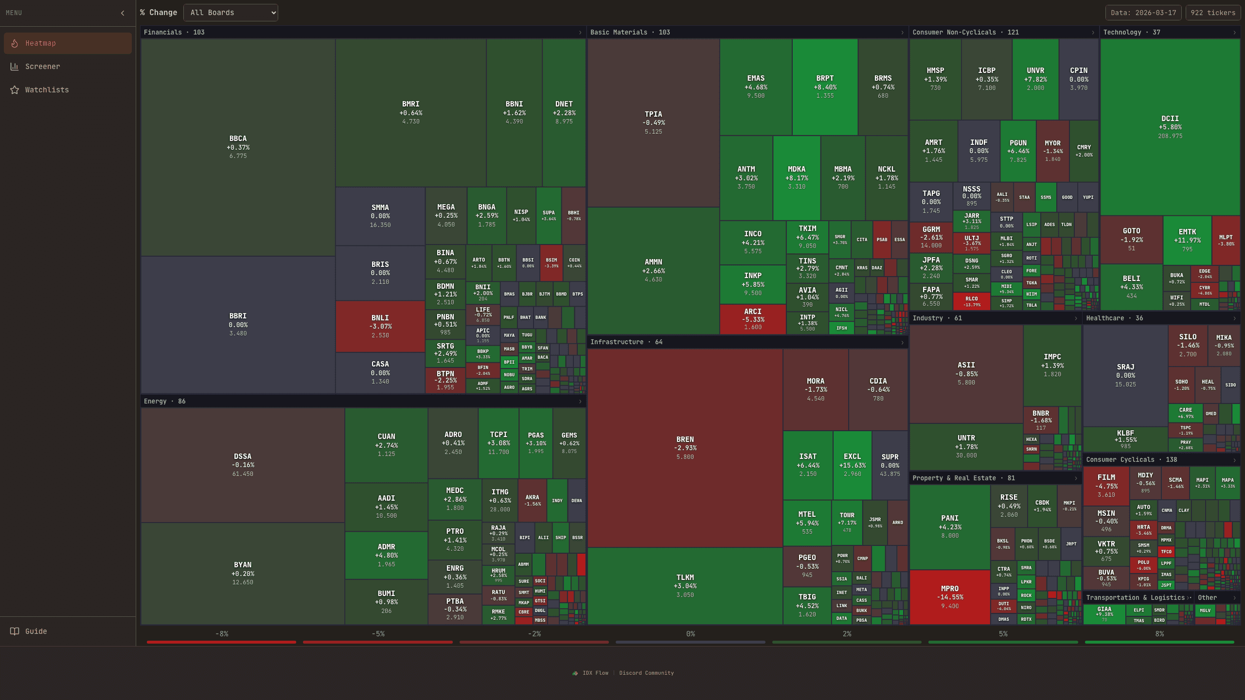
The stock heatmap gives you a bird's-eye view of the entire Indonesian stock market at a glance. Every stock is represented as a colored rectangle grouped by sector. The size of each rectangle reflects the stock's relative market capitalization, and the color represents the daily price change — green for gainers, red for losers, and gray for unchanged.
Color intensity indicates the magnitude of change. A deep green means a large positive move (e.g., +5%), while a faint green means a small gain. Similarly, deep red means a significant drop. This lets you instantly spot which sectors and stocks are moving the most.
Use the range filter bar at the bottom to focus on specific price change ranges. For example, you can filter to show only stocks that moved more than +3% to spot breakouts, or stocks that dropped more than -3% to find potential oversold opportunities.
Stock Screener
Filter, rank, and shortlist stocks using signal quality, market profile, Wyckoff structure, and flow edge.
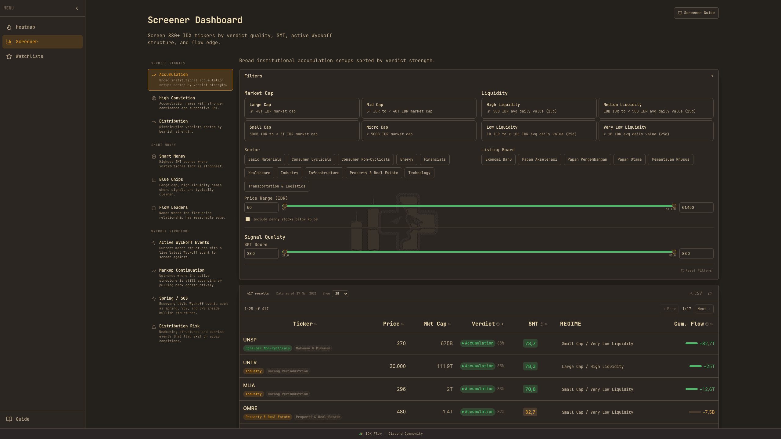
- 950+ IDX stocks ranked by multiple quantitative criteria
- 10 built-in presets for common trading strategies
- Columns: SMT, Verdict, Wyckoff Phase, R², Hit Rate, Cum. Flow
- Combine filters freely — market cap, sector, signal quality, and more
How to Use
Start with one of the 10 built-in presets (e.g., "Accumulation Setup", "Smart Money Picks") or build your own filter combination from scratch.
Verdict tells you the overall signal direction. SMT Score (0-100) tells you what smart money brokers are doing. "ACCUMULATION" + SMT > 60 is the strongest bullish setup.
"Accumulation" phase with a "Spring" or "SOS" event = highest-conviction buy. "Distribution" with "UTAD" or "SOW" = highest-conviction sell.
R² tells you how predictable the stock is using flow data. Hit Rate tells you how often the model gets direction right. R² < 3% and Hit Rate < 52% = likely noise.
Screener Columns
Each row in the screener shows: Ticker, current price, SMT Score (smart money direction), Verdict (overall signal), Wyckoff Phase (market cycle stage), R² (flow predictability), Hit Rate (prediction accuracy), and regime classification. Click any row to jump to that stock's detailed analysis.
R² (Predictability)
R² measures how well broker flow data can predict future price movements. Think of it like a weather forecast accuracy score — an R² of 0.10 means flow explains 10% of price moves. That might sound small, but in financial markets, even 5-10% explanatory power is statistically meaningful and provides an edge over random guessing.
SMT Score (Smart Money Tracker)
The SMT Score ranges from 0 to 100 and tracks whether institutional "smart money" brokers are net buying or selling. A score above 60 suggests bullish smart money activity (accumulation), while below 40 suggests bearish activity (distribution). The score combines five signals: net flow direction, broker persistence (conviction), concentration, absorption patterns, and execution quality.
Wyckoff Phases in the Screener
The screener shows the current Wyckoff phase and the latest detected event for each stock. Filter by phase to find stocks at specific stages of the market cycle.
Bullish Events (look for these in accumulation)
- Spring — False breakdown below support, then sharp reversal upward. One of the strongest buy signals.
- SOS (Sign of Strength) — Rally on expanding volume breaking above the trading range.
- LPS (Last Point of Support) — Final pullback before sustained uptrend begins.
- Continuation — Phase extends with consistent buyer dominance.
- Pullback — Healthy retracement in an uptrend, potential re-entry.
Bearish Events (watch out for these)
- UTAD (Upthrust After Distribution) — Spike above resistance that immediately reverses. Traps late buyers.
- SOW (Sign of Weakness) — Break below trading range on expanding volume.
- LPSY (Last Point of Supply) — Weak rally attempt before sustained downtrend.
- BC (Buying Climax) — Frantic buying on extreme volume. Often marks the top.
Structural Events (early signals)
- PS (Preliminary Support) — First sign of buying interest after decline.
- SC (Selling Climax) — Panic selling on extreme volume. Often marks the bottom.
- AR (Automatic Rally/Reaction) — Natural bounce after climax.
- ST (Secondary Test) — Price revisits climax area on lower volume.
- PSY (Preliminary Supply) — First sign of selling pressure after rally.
Regime Classification
Every stock is classified into a "regime" based on its characteristics. The regime determines how analysis weights are adjusted — because you can't analyze a micro-cap stock the same way you analyze a blue-chip.
Blue Chip
Blue Chip — Large cap, high liquidity, many brokers trading (e.g., BBCA, BMRI). SMT and CADI carry more weight because institutional signals are clearest here.
Mid Cap
Mid Cap — Moderate size and liquidity (e.g., ERAA, ACES). Balanced weight distribution across all factors.
Low Liquidity
Low Liquidity — Small/micro caps with few daily transactions. Buyer concentration and trading frequency matter more here because a single broker can move the price.
High Volatility
High Volatility — Stocks with large daily price swings. MFI (Money Flow Index) is weighted more heavily to filter noise from genuine signals.
Institutional-Driven
Institutional-Driven — Stocks where a few large brokers dominate trading (GVPR > 65%). SMT and buyer concentration are prioritized.
Hit Rate
Hit Rate measures how often the flow-price prediction model correctly predicted the direction of price movement. A hit rate of 50% means no better than a coin flip. Above 55% is a meaningful statistical edge. The model uses walk-forward validation — it only tests on data it has never seen before, preventing overfitting.
Screener Presets
AlphaFlow includes 10 built-in presets for common screening strategies. Each preset pre-configures the optimal combination of filters.
Accumulation Setup
Stocks in Wyckoff accumulation with bullish verdict.
Look for: Spring or SOS events confirming.
High Conviction
Strongest signals only — high SMT + high confidence.
Look for: Multiple factors agree strongly.
Distribution Warning
Stocks showing distribution signals.
Look for: UTAD or SOW events confirming.
Smart Money Picks
Top institutional activity regardless of phase.
Look for: Consistent SMT > 60 over multiple days.
Blue Chip Focus
Large cap, high liquidity stocks only.
Look for: SMT and CADI most reliable here.
Flow Leaders
Stocks where flow most reliably predicts price.
Look for: Best response to flow analysis.
Active Wyckoff Events
Stocks with a recent Wyckoff event detected.
Look for: Event type tells setup quality.
Markup Continuation
Stocks already in markup phase.
Look for: LPS events for pullback entries.
Spring / SOS Setups
The two most powerful Wyckoff buy signals.
Look for: Volume confirm + follow-through.
Watchlist
Create personal watchlists to track stocks you're interested in. You can create multiple watchlist groups (e.g., "Blue Chips," "Accumulation Candidates," "Short-term Plays") and organize stocks across them.
Add stocks from the screener or analysis page. Each watchlist item shows the current price movement, Wyckoff phase, and SMT score at a glance — so you can quickly scan your watched stocks for changes without opening each one individually.
Analysis: Summary
The summary tab is the first thing you see when analyzing a stock. It shows the price chart, Wyckoff phase overlay, stock profile radar, and the overall verdict.
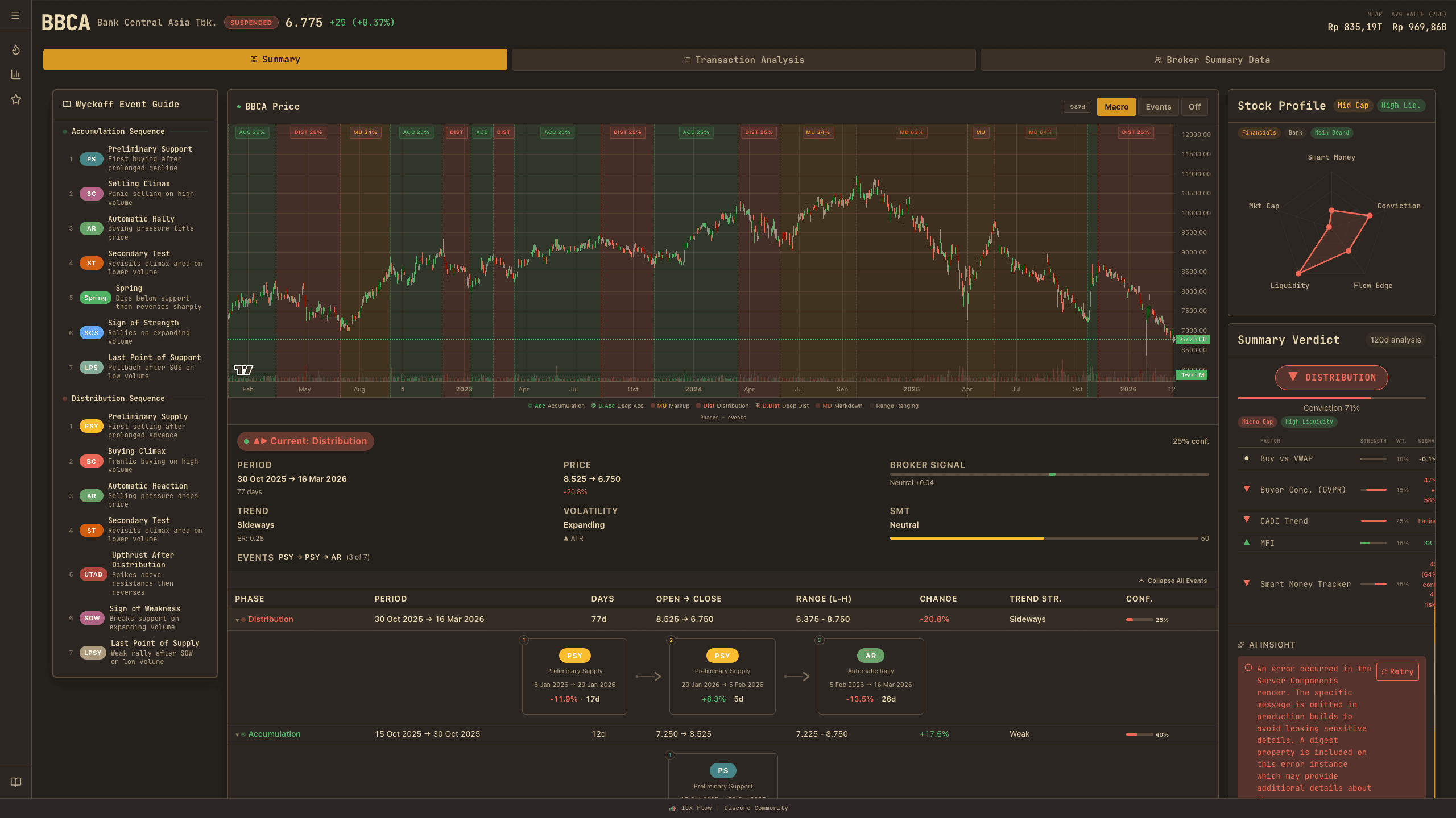
- Price chart with Wyckoff phase overlay and event markers
- Summary verdict with confidence percentage
- Stock profile radar — 5 axes at a glance
- Wyckoff event guide sidebar for easy reference
Wyckoff Phases & Events
Understand the four market cycle phases and the key events that signal transitions.
The Wyckoff method is a framework to understand market cycles through the lens of supply, demand, and institutional behavior. Every stock cycles through four main phases: Accumulation → Markup → Distribution → Markdown. AlphaFlow detects these phases automatically using a combination of broker flow analysis, price action, and volume patterns.
Accumulation
Accumulation — Smart money quietly builds positions after a decline. Price moves sideways in a range. Volume may decrease as selling pressure exhausts. Key events: PS (Preliminary Support), SC (Selling Climax), AR (Automatic Rally), ST (Secondary Test), Spring (false breakdown), SOS (Sign of Strength), LPS (Last Point of Support).
Markup
Markup — Price trends upward after accumulation is complete. Volume expands on up-days. The stock breaks above the trading range and enters a sustained uptrend. This is the phase where most profits are made.
Distribution
Distribution — Smart money sells into strength. Price moves sideways at the top of a rally. Volume spikes on up-days as institutions offload to retail buyers. Key events: PSY (Preliminary Supply), BC (Buying Climax), UTAD (Upthrust After Distribution), SOW (Sign of Weakness), LPSY (Last Point of Supply).
Markdown
Markdown — Price trends downward after distribution. Volume may increase as panic selling sets in. The stock breaks below support and enters a sustained downtrend.
Accumulation Events
- PS (Preliminary Support) — First sign of buying interest after a prolonged decline. Like the first person to arrive at a sale — they're testing the waters.
- SC (Selling Climax) — Panic selling on extreme volume. The last wave of fear. Like a clearance sale where everyone is dumping — this often marks the bottom.
- AR (Automatic Rally) — A natural bounce after the climax. Buying pressure lifts the price. Establishes the upper boundary of the trading range.
- ST (Secondary Test) — Price revisits the climax area on lower volume. Tests if sellers are truly exhausted. If volume is lower than SC, it confirms the bottom.
- Spring — A brief dip below support that quickly reverses. Like a trap — weak hands sell in fear, smart money buys the dip. One of the most powerful accumulation signals.
- SOS (Sign of Strength) — A rally on expanding volume that breaks above the trading range. Confirms accumulation is complete and markup is beginning.
- LPS (Last Point of Support) — A pullback after SOS on declining volume. The last buying opportunity before the stock enters a sustained uptrend.
Distribution Events
- PSY (Preliminary Supply) — First sign of selling pressure after a rally. Smart money starts lightening positions.
- BC (Buying Climax) — Frantic buying on extreme volume. Retail FOMO at its peak. Often marks the top.
- UTAD (Upthrust After Distribution) — A spike above resistance that immediately reverses. Like a Spring in reverse — traps late buyers.
- SOW (Sign of Weakness) — A break below the trading range on expanding volume. Confirms distribution is complete.
- LPSY (Last Point of Supply) — A weak rally after SOW on declining volume. The last chance to exit before markdown.
Summary Verdict
The final synthesis of all signals into one actionable recommendation with confidence scoring.
The verdict is the final synthesis of all signals into one actionable recommendation. It combines 7 weighted factors that are adjusted based on the stock's regime, then produces a signal with a confidence percentage.
Five verdict signals: STRONG ACCUMULATION (multiple bullish factors converging with high confidence), ACCUMULATION (net bullish bias), NEUTRAL (mixed signals — wait for clarity), DISTRIBUTION (net bearish bias), STRONG DISTRIBUTION (multiple bearish factors with high conviction).
Confidence percentage reflects how many factors agree with the verdict direction. Higher confidence (70%+) means most indicators point the same way. Low confidence (50-60%) means some factors disagree — proceed with caution.
Stock Profile Radar
The radar chart visualizes five key dimensions of a stock's profile at a glance. A larger polygon means stronger overall characteristics. The shape tells you what kind of stock you're looking at.
The five axes: Smart Money (SMT score — institutional activity), Conviction (verdict confidence — how aligned the signals are), Flow Edge (hit rate — prediction accuracy), Liquidity (daily trading value — how easy to buy/sell), Market Cap (company size — larger = more stable).
Analysis: Transaction
The transaction analysis tab digs deeper into broker behavior with core metrics (CADI, VWAP, GVPR) and advanced signals (SMT, divergence detection, flow-price prediction, concentration asymmetry).
- Core metrics: CADI trend, VWAP deviation, GVPR participation
- Smart Money Tracker (SMT) score with 5-component breakdown
- Flow-price prediction model — R², Rank IC, Hit Rate
- Divergence detection and concentration asymmetry (entropy-based)
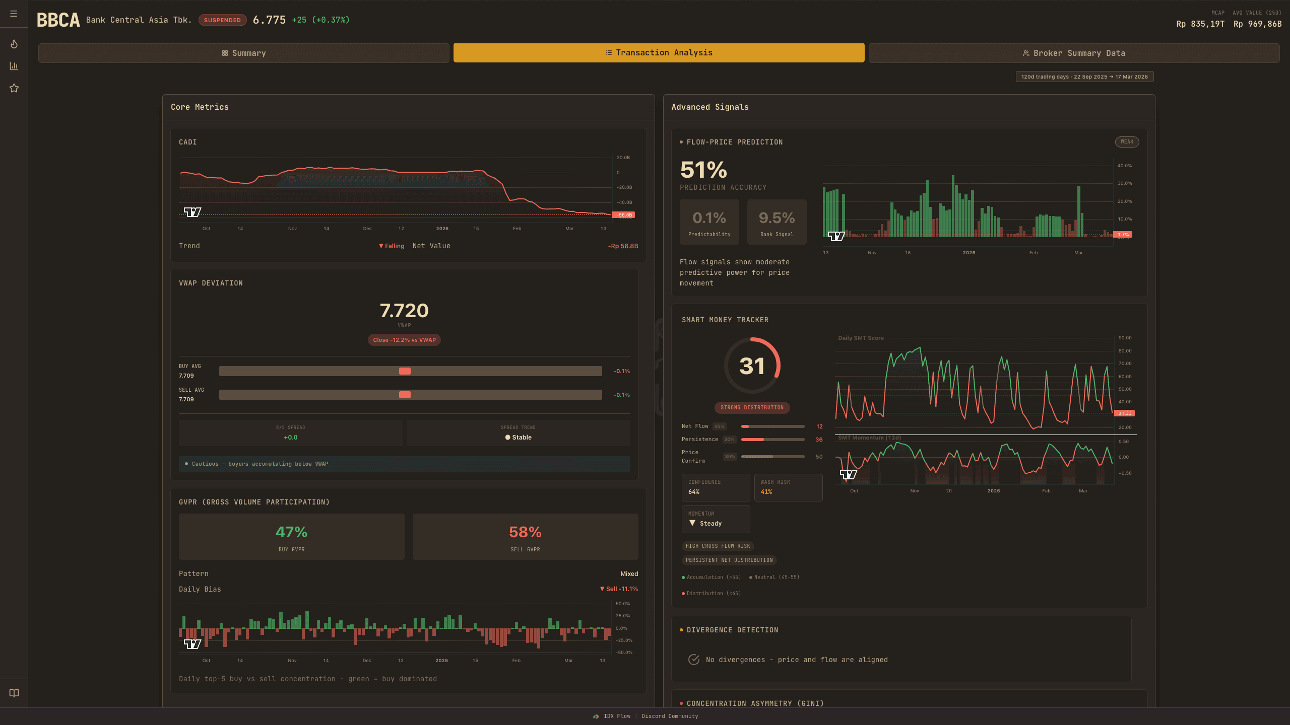
Core Metrics
CADI, VWAP Deviation, and GVPR — the three foundational metrics for understanding broker behavior.
CADI (Cumulative Advisor Dollar Index)Core
CADI tracks the net dollar flow of the top 10 most active brokers each day. It multiplies their net lots (buy minus sell) by the closing price, then accumulates over time. When CADI is rising, the biggest brokers are net buying — when falling, they're net selling.
VWAP DeviationCore
VWAP (Volume Weighted Average Price) represents the "fair price" based on all trades that day — it accounts for both price and volume. VWAP Deviation shows if institutional buyers are paying above fair value (premium, high conviction) or below (discount, opportunistic buying).
GVPR (Gross Volume Participation Ratio)Core
GVPR measures how concentrated trading volume is among the top 5 brokers. High GVPR (above 60%) means a few big players dominate — this is institutional-driven trading. Low GVPR (below 30%) means trading is dispersed among many small players — this is retail-driven.
Advanced Signals
SMT score, divergence detection, flow-price prediction, and concentration asymmetry.
Smart Money Tracker (SMT)
SMT is the flagship indicator of AlphaFlow. It produces a score from 0 to 100 that represents the net direction of institutional smart money activity. The score is calculated from five weighted components:
Net Flow30%
Net Flow (30% weight) — Are top brokers net buying or selling today? This captures the raw directional signal.
Persistence25%
Persistence (25% weight) — Are brokers staying in the same direction for multiple consecutive days? High persistence means conviction, not just a one-day trade.
Concentration20%
Net Concentration (20% weight) — Are the biggest players aligned on the same side? If the top 5 buyers are large but sellers are small and dispersed, that's strong concentration.
Absorption15%
Absorption (15% weight) — Is high volume occurring with low price movement? This signals institutional absorption — big players buying all available supply without letting the price rise, like quietly buying inventory before announcing a sale.
Execution10%
Execution Quality (10% weight) — Did smart money get good fill prices? If the biggest buyers bought below the closing price, they executed well — suggesting they know what they're doing.
Divergence Detection
Divergence occurs when price and indicators disagree — this often precedes reversals. AlphaFlow detects three types:
- CADI Divergence — Bullish: price falling but CADI rising (smart money accumulating into weakness). Bearish: price rising but CADI falling (smart money distributing into strength).
- MFI Divergence — Bullish: price falling but MFI (buying pressure) rising. Bearish: price rising but MFI weakening.
- Frequency + Concentration Divergence — Detects institutional split-order patterns. When trading frequency rises but prices stay flat, and buy-side concentration is high, it may indicate hidden institutional accumulation.
Flow-Price Prediction
This uses a statistical model (ridge regression with walk-forward validation) to test whether broker flow data can predict future price movements. Three key metrics measure the model's performance:
R\u00B2 (Predictability)Key
R² (Predictability) — What percentage of price movement can be explained by broker flow. Above 5% is statistically meaningful. Above 15% is strong.
Rank ICKey
Rank IC (Information Coefficient) — Correlation between predicted price rankings and actual rankings. Above 0.10 is a useful signal. This metric is robust to outliers.
Hit RateKey
Hit Rate — How often the model correctly predicted the direction (up or down). Above 55% is a meaningful edge over random chance.
Concentration Asymmetry
This uses Shannon entropy and the Effective Number Ratio (ENR) — information theory metrics — to compare buy-side vs sell-side concentration. Low entropy means a few brokers dominate (concentrated); high entropy means flow is spread evenly (dispersed). When buy-side is more concentrated than sell-side, it signals institutional accumulation.
Positive asymmetry: institutional accumulation (buy-side more concentrated). Negative: institutional distribution (sell-side more concentrated). Near zero: balanced/retail-driven.
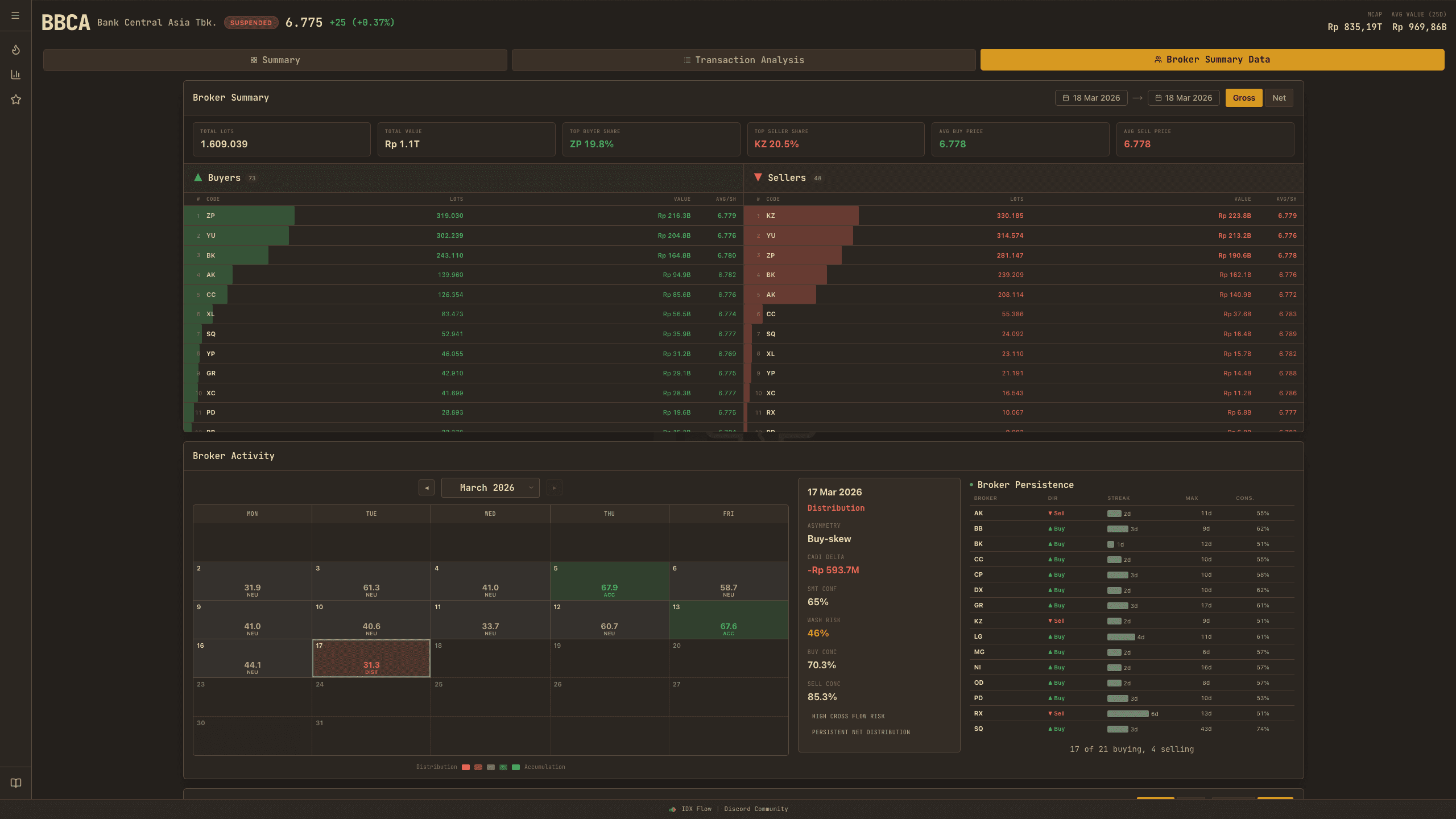
Broker Summary Data
Drill into individual broker behavior with summary tables, activity calendars, Sankey diagrams, and flow overlays.
- Buyer/seller tables with gross and net toggle
- Activity calendar heatmap showing daily broker patterns
- Sankey flow diagram — who buys from whom
- Broker flow overlay on candlestick chart — cumulative lines per broker
Broker Summary
The broker summary table shows aggregate buy/sell data per broker over a date range. Toggle between Gross (total volume on each side) and Net (buy minus sell). Use the date picker to adjust the analysis period. Each row shows the broker code, their buy and sell values, lots, and net position.
Broker Activity Calendar
A calendar heatmap showing daily broker activity patterns — SMT score, concentration, and direction signals for each trading day. Hover over a day to see detailed metrics. This helps you spot patterns over time, like sustained accumulation periods or sudden shifts in broker behavior.
Broker Distribution (Sankey)
The Sankey diagram visualizes the flow of trading volume between brokers. Buyers flow from the left into the stock, and from the stock out to sellers on the right. Thicker flows mean larger volumes. Toggle between Gross/Net and Volume/Value to see different perspectives.
Broker Flow Overlay
A combined price candlestick chart with cumulative broker flow lines overlaid. By default, it shows the top 3 net buyers (solid lines) and top 3 net sellers (dashed lines). Each line represents the cumulative net flow of a specific broker — rising means net buying, falling means net selling.
Disclaimer
Important
All data, analysis, scores, signals, and verdicts on AlphaFlow are for educational and informational purposes only. Nothing on this platform constitutes financial advice, a recommendation, or an offer to buy or sell any security. Always Do Your Own Research (DYOR) before making any investment decision. Past performance does not guarantee future results.
Trading involves substantial risk of loss. You are solely responsible for your own trading and investment decisions. AlphaFlow and its creators shall not be liable for any losses you incur.